The most underrated UX case study of all time: Checking your bin collection date
Did you know, as a kid, I aspired to be a bin man?
Why?
-
Those big trucks were pretty cool
-
They’d always smile and wave at you as you stared at them through the window
Fast forward to today and I’m adulting hard.
I’m checking for when my bins are getting collected.
As an award-winning product builder, I’m always analysing flows and experiences to spot improvements.
Digital experiences that councils offer are the perfect breeding grounds for poor UX so you’ll spot plenty of room for improvements there.
Match this to being a junior designer or developer, creating your own case study around improving one of these poor UX flows is a perfect way to showcase your skills.
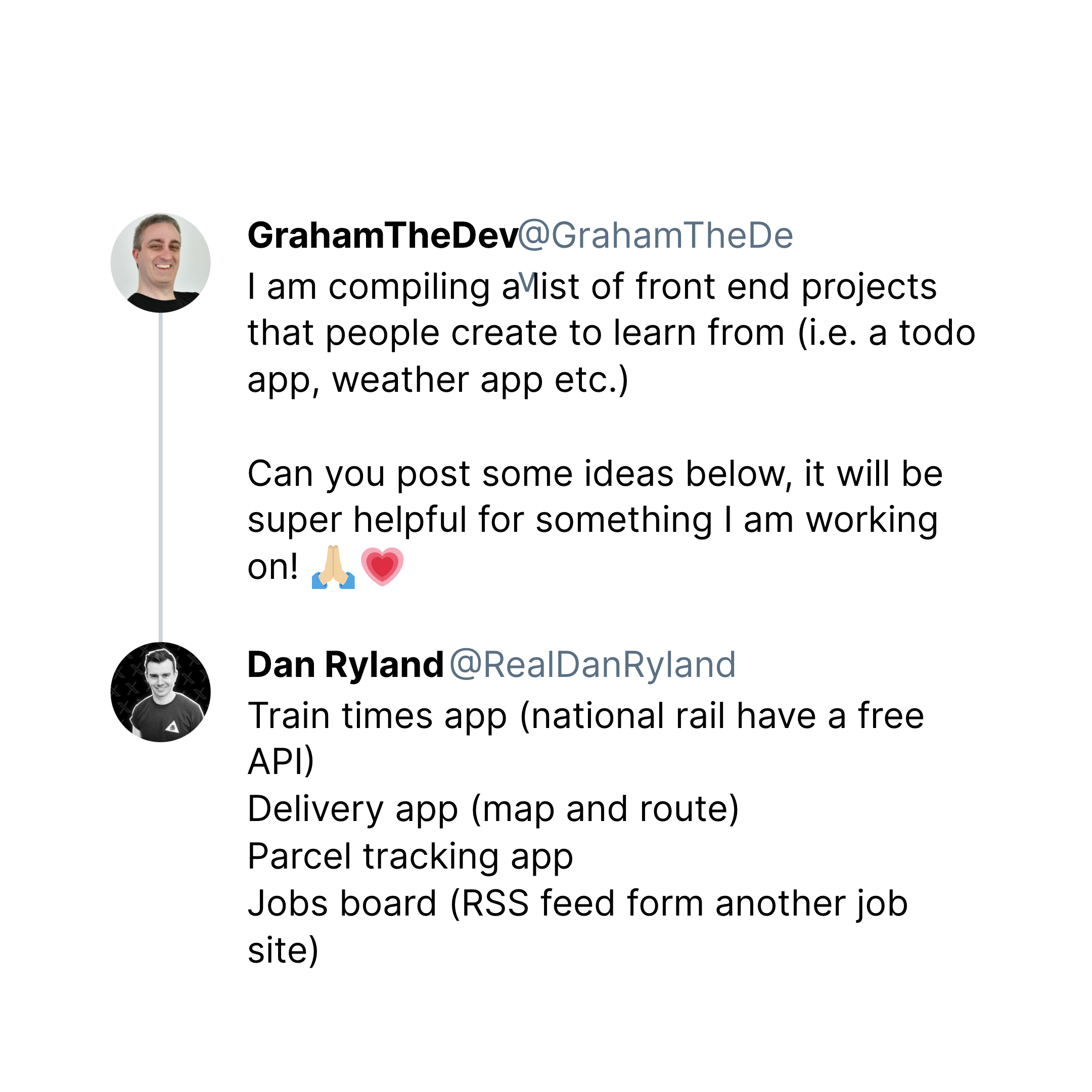
Going beyond a typical todo app or weather app, I like suggesting alternative areas of interest:
Now I’ve found something new to add to the list:
Checking bin collection dates
So why are these digital experiences so poor?
They’re not resident focused.
They fail to prioritise information to effectively assist with the task.
Of course, you could say councils are strapped for cash and in some cases going bankrupt, but good UX doesn’t need to be expensive.
It just requires a little extra thinking before building any ‘solution’.
As a side note, I’m a big fan of The Rest is Politics
It’s a podcast that offers an insider’s view on politics.
I’d assume that if you campaigned hard around sorting bins, potholes and fly tipping, you’d probably have a good chance of getting elected as a councillor.
That’s one step of many steps to become the prime minister.
Getting back to our all important bin collection flow…
As a resident, my needs are:
-
What’s being collected and when? (general vs recycling)
-
Do I need to do something about it now or do I have time?
To meet this need, I know I’d probably need to provide an address.
As a second side note, I wish councils would provide more open APIs for their services to promote greater innovation.
Octopus Energy is a great example of this.
Their API allows their customers to build their own usage trackers.
I actually built an Apple fitness meets Gas/Electric usage app called OctoPulse using their API.
Again another one for the list.
Now in dissecting my local council’s flow, their flow:
-
Asks for your address
-
Requires you to confirm your address (pointless if there’s only one result - just continue through)
-
Show you your address again and scroll (I’m on my phone) till you find what you actually need
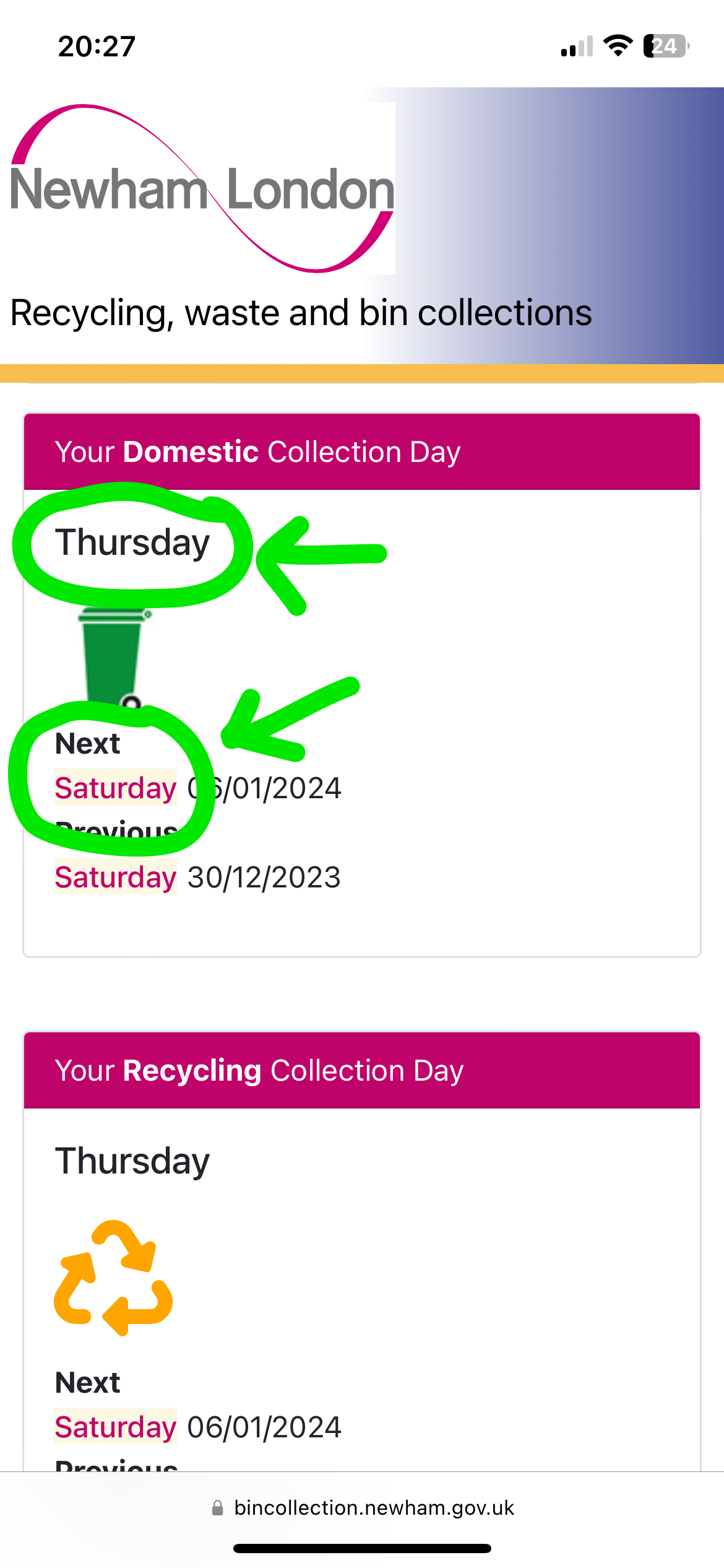
Funnily in this example the UI tells me my collection day is Thursday when my next collection is actually Saturday.
Confusing.

When showing dates, I find the most accessible format for dates is 4 May 2024 rather than 04/05/2024
It also avoids the US/British formatting differences.
Browsing other bin collection flows, other councils haven’t done much better.
The results are pretty poor.
Presenting my Airtable of observations!
So what’s the ideal flow?
-
Input your address once
-
Only if the system finds multiple matches, ask to confirm
-
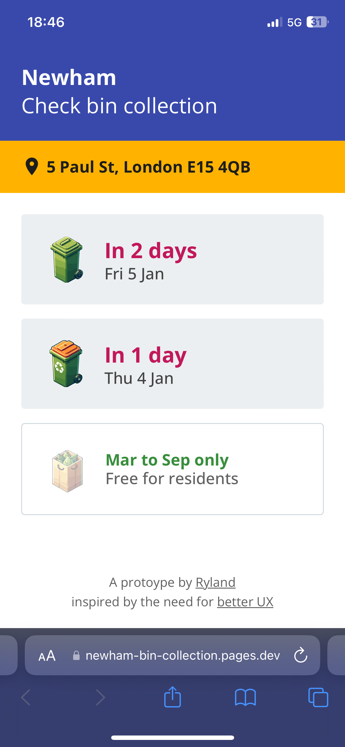
Show relative time frame for each type of bin with minimal scrolling (eg In 1 day or today)
-
Visually show bins (photo or colour)
Now to build a quick prototype.
I couldn’t reverse engineer an API call because they’re using .NET so I used Apify to mimic the same flow and provide the information back to my prototype.
This takes longer than a typical API call (~8-10s) but as it’s just a prototype I’m ok with it.
My UX-itch has been satisfied.
I’m also using less cognitive load to figure out if the bins need to be out today or not.
Win.
Want to compare the flows for yourself?
Here’s an address to try:
5 Paul St, London E15 4QB
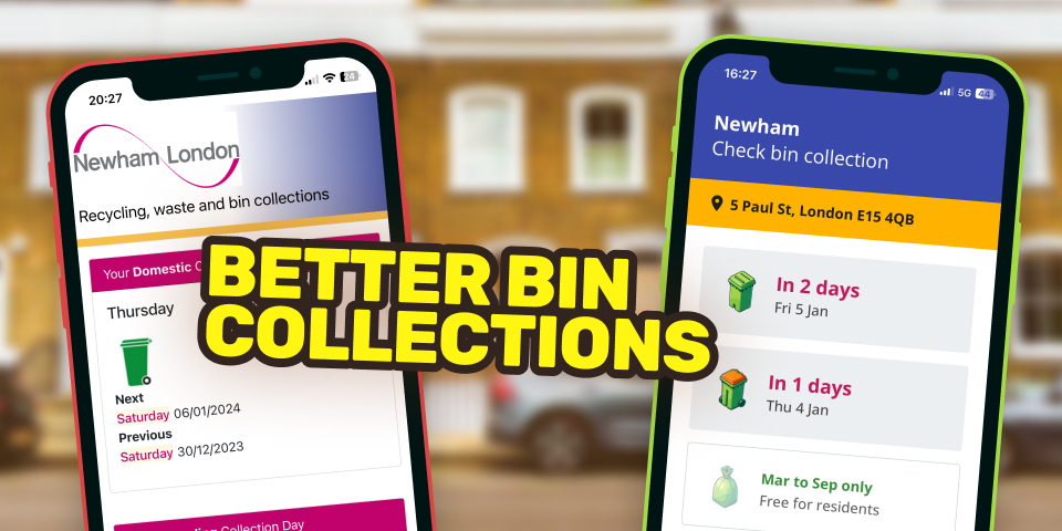
The existing experience vs my proposed experience
So how many stars would you give your council’s bin collection flow?
Until next time, keep hammering those nails.
P.S. Newham Council: I’m open to collaborating.

